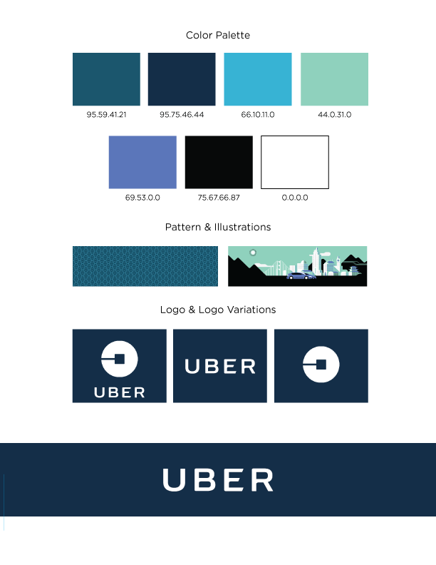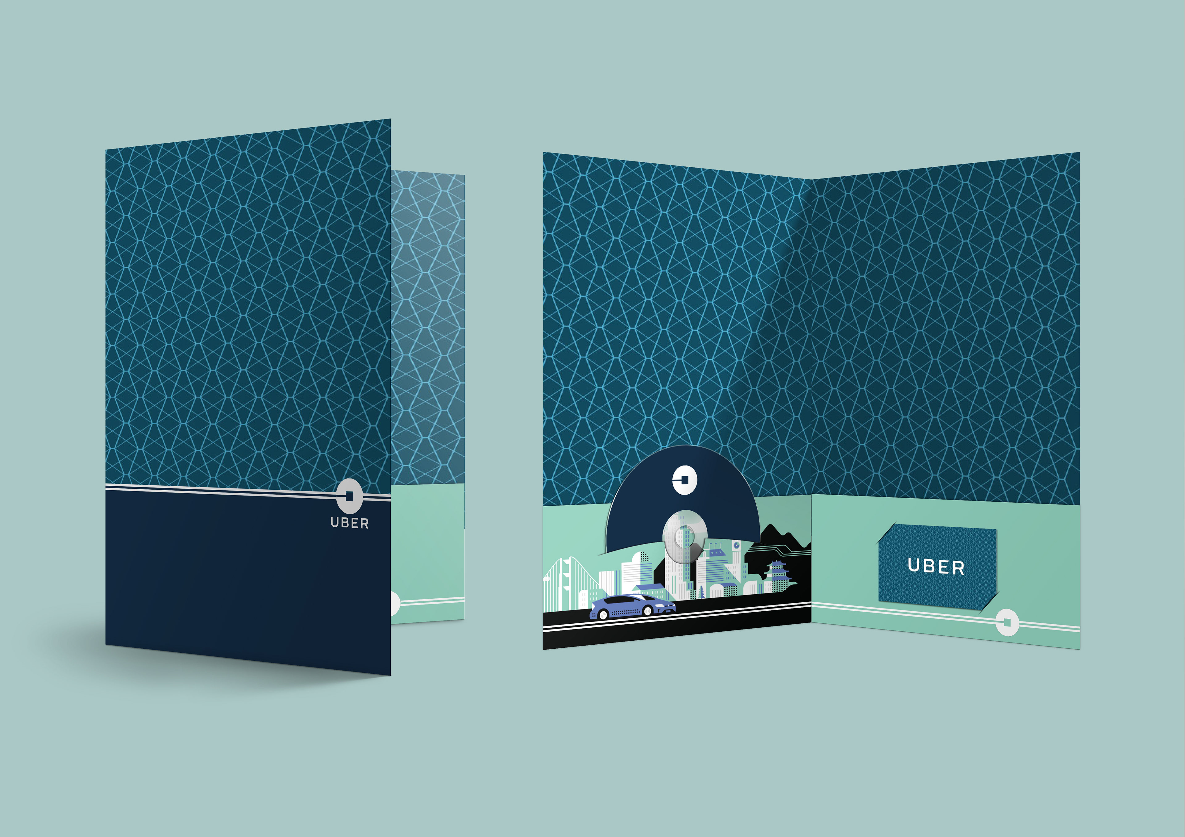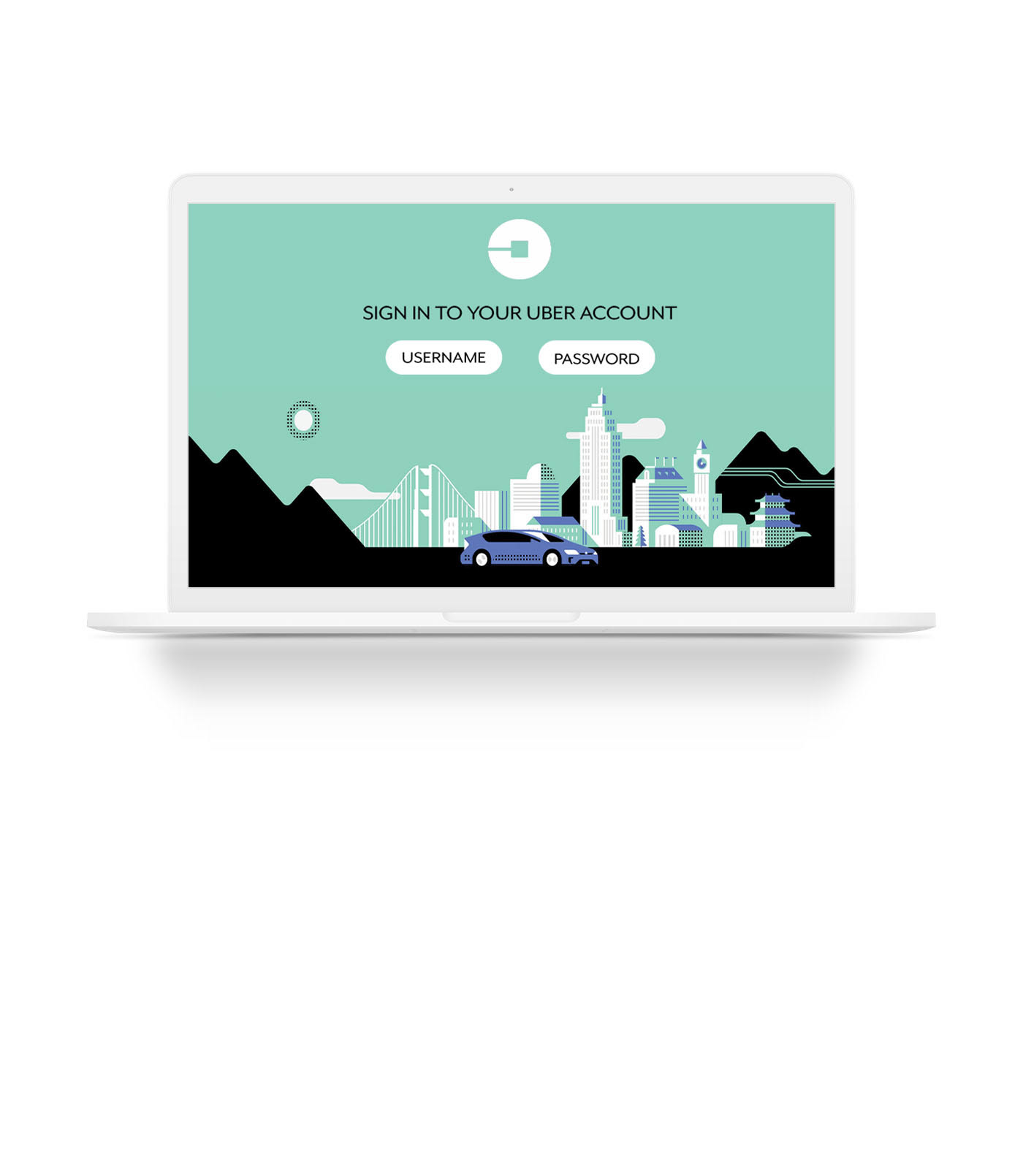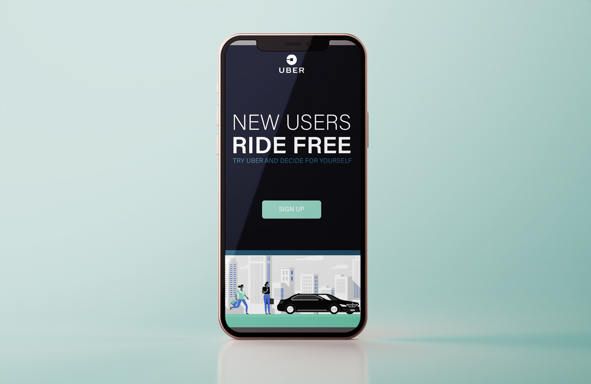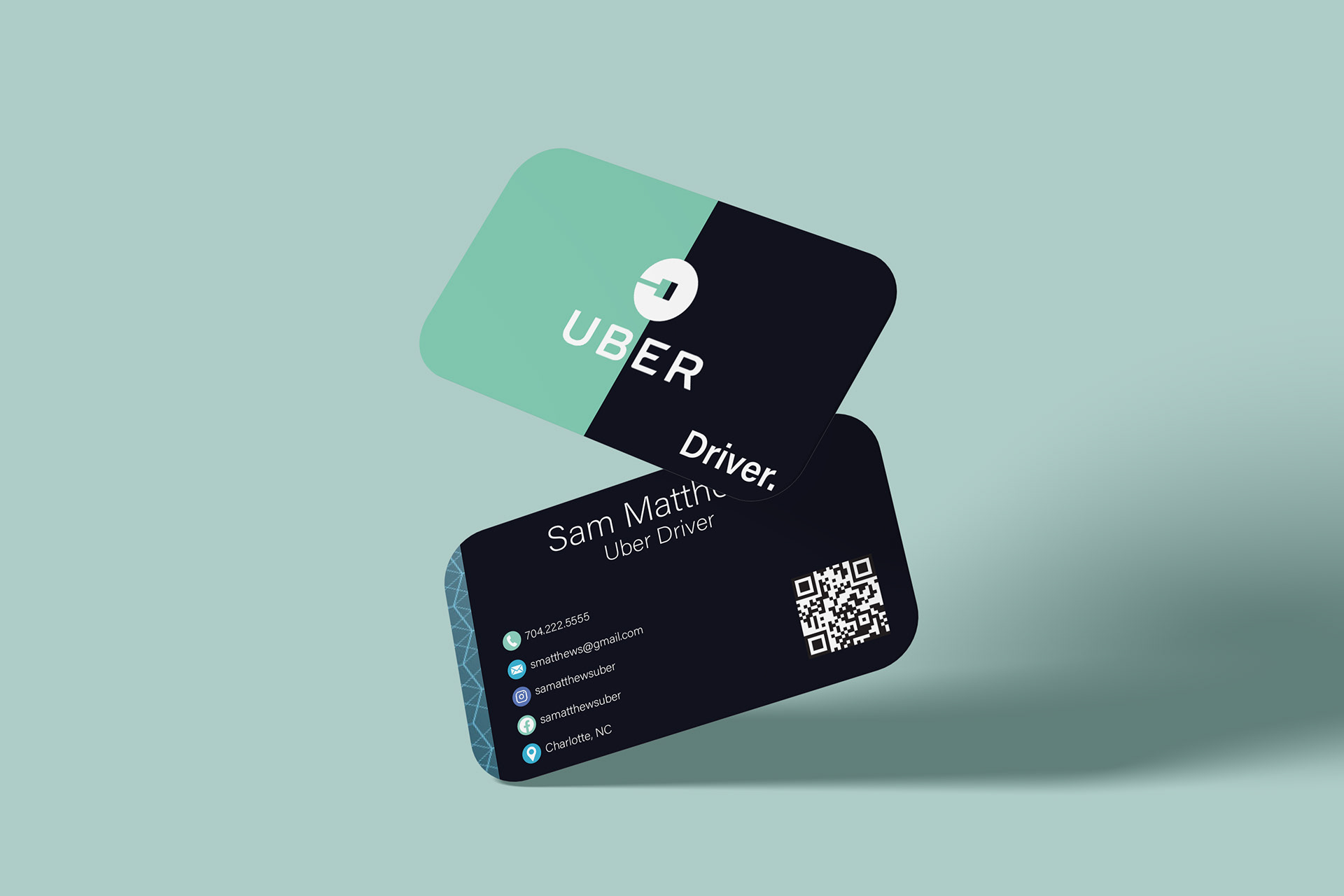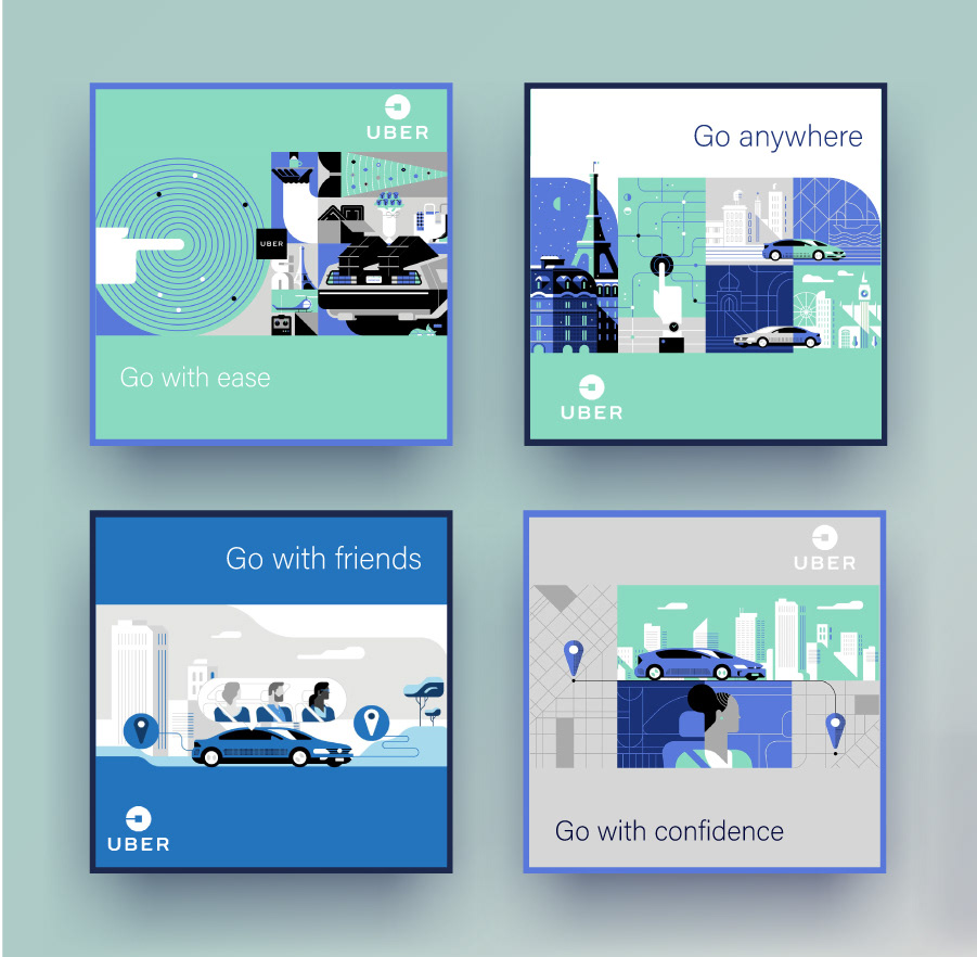
For this case study I was given the challenge to research an existing brand with an established brand identity and to design collateral that followed the company's guidelines. For my chosen brand Uber, I conducted research on the popular brand and found that the company recently updated their brand guidelines. With this recent update, Uber completely changed their familiar logo to a simplistic symbol that represented the idea behind their new identity, bits and atoms. Uber also incorporated patterns and illustrations which I enjoy working with myself. For my finished packaged design I created a pocket folder, company letterhead, business card, social media posts and digital banner ad that followed the specific guidelines in the brand.